1. The Core Philosophy: "The Responsive Eye"
Op Art is scientific and mathematical. It is not interested in emotions, stories, or social commentary. It is interested in perception. The Glitch in the Brain: The human brain is hardwired to organize visual patterns. Op Art creates contradictory data (e.g., extreme contrast or confusing perspective). The brain struggles to resolve this conflict, resulting in the sensation of movement. The Physical Reaction: Op Art is one of the few styles that elicits a physical reaction. Viewers often report feeling dizzy, disoriented, or nauseous. Abstract Formalism: Op Artists believed that "art" shouldn't be about the artist's ego. It should be about the viewer's experience.2. Key Characteristics | How do you recognize Op Art?
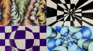
Black and White: The most famous early Op Art used only black and white because it creates the highest possible contrast, maximizing the confusion for the retina. Precision: There are no brushstrokes visible. The lines are razor-sharp, often requiring the use of tape, rulers, and assistants to paint. It looks machine-made. Repetition: Simple shapes (lines, circles, squares) are repeated over and over, often with slight shifts in angle or size to create the illusion of warping depth. Figure-Ground Tension: In a normal painting, you can tell what is the object (figure) and what is the background. In Op Art, the positive and negative spaces are equal, so your eye flips back and forth, unable to decide which is which.3. The Science Behind It
Op Artists studied psychology and biology. They used specific scientific phenomena: 1. Retinal Fatigue (After-Images): If you stare at a bright color (like red) and then look at a white wall, you see the opposite color (green). Op artists placed complementary colors right next to each other to make the border between them "vibrate." 2. Moiré Patterns: When two grid patterns are overlaid at a slight angle, they create a third, wavy pattern that seems to ripple. 3. Perspective Warping: By gradually making lines thinner or closer together, the flat canvas appears to swell out or cave in (3D illusion).
4. The Key Artists
While many experimented with illusions, two names stand above the rest.A. Victor Vasarely (The Father)
A Hungarian-French artist who started experimenting with optical tricks as early as the 1930s (e.g., his Zebra painting). Style: He is famous for colorful, bulging geometric lattices. He treated art like a science, creating a "plastic alphabet" of shapes and colors that could be rearranged endlessly. Goal: He wanted to democratize art. He believed his geometric art could be mass-produced and printed on everything, making it accessible to everyone, not just the rich.B. Bridget Riley (The Star)
A British artist who became the face of the movement in the 60s. Style: Primarily black and white (in the beginning). She focused on the sensation of instability. Her paintings look like sheets of metal that are rolling or folding. Effect: Her work is so intense that gallery guards famously complained about getting motion sickness from watching her paintings all day.C. Josef Albers (The Teacher)
A former Bauhaus teacher who wrote the book Interaction of Color. Contribution: He didn't paint "illusions" of movement, but illusions of color. He showed that the same color looks totally different depending on what background it is placed on. His Homage to the Square series explores this endlessly.5. The Turning Point: "The Responsive Eye" (1965)
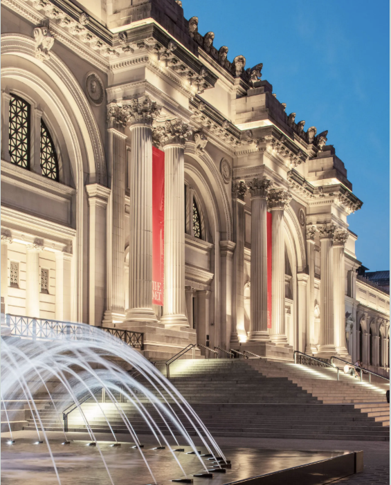
Op Art hit its peak with a massive exhibition at the Museum of Modern Art (MoMA) in New York called The Responsive Eye. The Reaction: The public loved it. It was fun, interactive, and cool. The Backlash: The critics hated it. They called it "gadget art" and "gimmicks." They felt it was too shallow and easy to like. Commercialization: Because the patterns were geometric and cool, the fashion industry stole them immediately. Within months, Op Art was on dresses, wallpaper, and handbags. This caused the "serious" art world to reject the movement as a fad.6. Legacy: Why does it matter?
Op Art faded by 1970, but its influence is everywhere: Graphic Design: Logos and branding use Op Art principles to catch the eye. Psychology: It helped scientists understand how human vision processes data. Digital Art: Op Art was "algorithmic" before computers existed. Today, digital artists use code to generate complex Op Art animations (GIF art).Route
Art Galerie Marketplace
5 Brayford Sq, Stepney Green
London E1 0SG United Kingdom (UK)
Additional phone number: +55 31 99806-4815
Email: service@artgalerie.com.br
URL: https://artgalerie.com.br/
| Monday | Open 24 hours |
| Tuesday | Open 24 hours |
| Wednesday | Open 24 hours |
| Thursday | Open 24 hours |
| Friday | Open 24 hours |
| Saturday | Open 24 hours |
| Sunday | Open 24 hours Open now |
